Monday, 14 May 2012

Water


Creative Commons Licence
Shoes by Madi is licensed under a Creative Commons Attribution-NonCommercial-NoDerivs 3.0 Unported License.


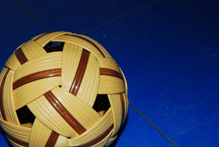
I adjusted the lighting on all these pictures to make them for vivid. I changed the lighting, the brightness and contrast, and color tones which creates more effective photos.  

Friday, 11 May 2012

At the River


The tree in this photo follows the rule of thirds and I like how the girl, specifically her jacket, is in contrast with the rest of the picture.


I used rule of thirds for this picture and focussed in on the dandelion while blurring the grass in the background.


The girls in this photo are not perfectly centered which I did on purpose and found it to be an effective strategy, and I found that the fence added an interesting background.


This bridge leads the eye to the other side of the river, and if you look in close, you can see the goose peeking out from the bride, which incorperates both architecture and wildlike in this photo.


I love this photo becasue the cracks in the ground look so much bigger than they actually are, and I find that it adds a dramitc effect.


Wednesday, 9 May 2012

Lighting


Fill Light


Key-Fill


 Key Light


Key-Back


Back Light


Fill-Back


Key-Fill-Back


Monday, 7 May 2012

Zoo Photos


The quality of my photos for this assgnment isn't so great, so I adjusted the lighting on all of them. I specifically highlighted the owl so that it stood out against the fence.


I enjoy this photo because of how the fox fits perfectly in the fence link. It looks very cozy and cute sitting near its den.


I find that with this picture, the sign grabs your attention first and then your eye is led down to the duck in the bottom left corner.


I find that the fence is an effective strategy for this photo, and liked the vibrancy of the lighting.


I thought the yak and bird looked really cute together and liked how the fence centered them in the picture.

Thursday, 3 May 2012

White Balance


Auto


Incandescent


Fluorescent


Direct Sunlight


Flash


Cloudy


Shade

Tuesday, 1 May 2012

Photoshop Assignment


Adjustment Layers (Original)


Ajustment Layers:
Originally the lighting in the photo was very yellowed and blurry, so I sharpened the image and readjusted the lighting using the adjustment layers tool.


Brushes
I used various brush tools along with my blooming artisic ability to create this materpiece.


Clone Stamp Tool (Original)


Clone Stamp Tool:
My main focus for this photo was to get rid of the mug in the background. I found it distracting, and so using hte clone stamp too I made it disappear.


Layer Styles (Original)


Layer Styles:
The only way I changed this photo was by adding my name in the top left corner, in order to prevent other scoundrels from stealing my lovely image.


Liquify (Original)


Liquify:
I enjoy the adjustments I made to this photo because it appears as if the three girls are hiding in some sort of vortex. I used the liquify tool to make these interesting and creative adjustments. 


Selections (Original)


Selections:
This is my favorite photo out of this assigment because of how the shoes stand out in contrast with the background. I used selections and adjustment layers to 'spice up' this image.